Dubai moves fast, and attention moves even faster. In a split second your audience decides whether to lean in or keep scrolling. That first instinct is rarely about a paragraph of copy; it is about what people see. That is where visual perception activities become practical; it explains how the brain reads color, form, contrast, motion, and context, then turns those cues into meaning. At Pella Dynamics PR agency, we take those same cues and, through Positive PR, turn them into proof of credibility, so what people see feels true, relevant, and worth sharing.
What visual perception activities means for brand communication
Visual perception is the brain’s shortcut system. It spots patterns, groups similar things, and follows the most obvious path through a page. People do not read every pixel; they read structure. A clear layout, a confident color palette, and a single focal point tell the story before a line of copy does. Pella Dynamics PR agency uses that reality to reinforce trust, align expectations, and build a reputation that lasts, especially across Arabic and English environments in the UAE.
A few helpful ideas from psychology, top-down processing means prior experiences shape what people expect, Gestalt principles help the brain simplify busy layouts, and attention sticks to contrast, motion, faces, and clean alignment. Our teams design with these in mind from the first wireframe to the final asset.
From visual perception to Positive PR, the Pella Dynamics way
Think of Positive PR as meaning "by design". At Pella Dynamics, color, type, spacing, and motion become confidence cues across every touchpoint: your website, your press kit, a LinkedIn carousel, and a deck you present at DIFC. We call this a perception system: one set of visual rules, proofs, and behaviors that stays consistent across channels. The aim is consistency, the same quality signal everywhere, so people feel clarity and care every time they meet the brand.
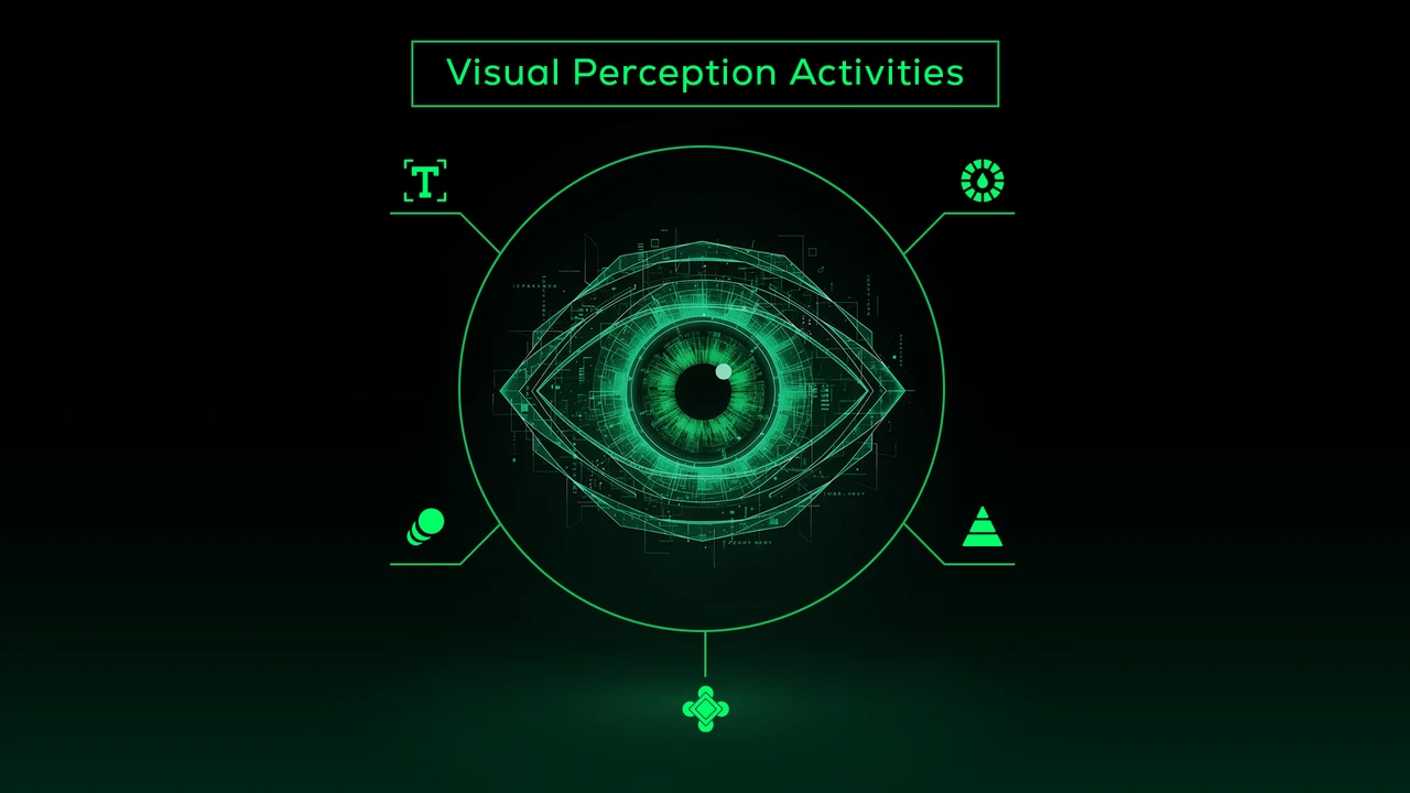
5 visual perception principles that lift credibility
1) Color sets the mood Color lands before words do. A refined palette signals personality, deep neutrals read as premium, energetic accents read as innovative, and fresh tones read as sustainable. Pella Dynamics PR agency treats color like a system; we keep contrast accessible, define when and where highlights appear, and document usage so teams apply it the same way on site, on social media, and in print.
2) Hierarchy guides decisions Size and spacing are not decoration; they are instructions. Lead with a decisive headline, follow with a value-focused subhead, keep copy tight, and pair it with one convincing proof like a KPI, a quote, or a logo wall. When scanning feels effortless, authority rises. Our designers at Pella Dynamics build typographic scales and spacing tokens that make this effortless for in-house teams and partners.
3) Gestalt makes it simple Group related elements, keep spacing consistent, and let a strong grid do the heavy lifting. When the eye can complete patterns easily, the brand feels organized and dependable. Simplicity reads as confidence. We rely on grids and component libraries so every new page or post inherits the same logic without extra effort.
4) Motion should point to value Subtle movement draws attention, not fireworks, just enough to reveal a testimonial, spotlight a media feature, or surface a clear call to action when interest peaks. Motion that follows purpose keeps people focused instead of distracted. Pella Dynamics PR agency maps motion to moments, micro interactions that guide, not overwhelm.
5) Typography carries tone Choose a clean headline face and a highly legible text font, then set line length and spacing for mobile-first reading. Use type scales and weight changes to create rhythm, so key claims are obvious at a glance. Our practice standardizes Arabic and Latin type pairings so parity between scripts feels natural and premium.
Visual perception activities for UAE audiences
Cultural fluency builds trust. If your audience is bilingual, Arabic and English should feel equally premium. Mirror hierarchy across both scripts, align tone and weight, and design grids that flip gracefully from left to right and right to left. Check icons and arrows so they make sense in both directions. Respect category codes too; finance, real estate, hospitality, health, and mobility each have familiar visual cues in the UAE. Use those cues with intent, then add a distinctive mark that is unmistakably yours.
Pella Dynamics PR agency field tests layouts with local audiences, then refines palettes, imagery, and microcopy to match real expectations.
Turn proof into pictures, the Pella Dynamics proof model
Positive PR thrives on evidence, earned media, expert quotes, client results, and community projects. Visual perception activities help you package that proof so credibility is obvious at a glance. Keep logo arrays neat with consistent spacing and often greyscale for elegance, design testimonial cards with real names, roles, and one compact metric, showcase study snapshots that pair a single KPI with a short outcome line, and present impact visuals for CSR that show people and progress, not just icons. Pella Dynamics uses standardized proof components so these signals appear the same way on every channel, which speeds recognition and builds belief.
Measure what people see and feel
Go beyond clicks. Test recall: can people recognize your brand from a cropped tile or a color swatch? Watch trust signals, and do testimonials and media features increase time on page or contact conversions? Read flow with heatmaps and scroll depth, then adjust hierarchy if needed. Run quick brand-feeling polls with words like 'confident', 'innovative', and 'reliable', and map those feelings back to visual choices. Pella Dynamics rolls these checks into a perception dashboard, so design changes tie directly to engagement quality and qualified leads.
A simple blueprint you can use
Aim for one story per screen; design each section around a single promise or proof. Keep signals consistent; color, type, and layout should behave the same across the website, socials, and PDFs. Choose imagery that reflects the UAE context, people, places, and scenes that feel familiar to your audience. Respect accessibility with solid contrast; it widens reach and communicates care. Make the next step obvious: book a call, download the report, request a proposal, and place that action where attention naturally peaks. This is the same checklist Pella Dynamics PR agency uses to keep multi-channel campaigns coherent.
To sum up
Most brands already invest in performance channels; the edge appears when perception and performance move together. Visual perception in psychology turns design choices into easy-to-read evidence. Pella Dynamics keeps those choices consistent and human across coverage, executive content, creator collaborations, and live activations. When people see clarity, they feel confidence, and confidence turns into conversations, referrals, and opportunities.
Ready to make trust visible on sight, Pella Dynamics designs visual systems and Positive PR programs for Dubai and the wider UAE, across Arabic and English, online and in person. Book a call and let us architect signals your audience instantly believes.